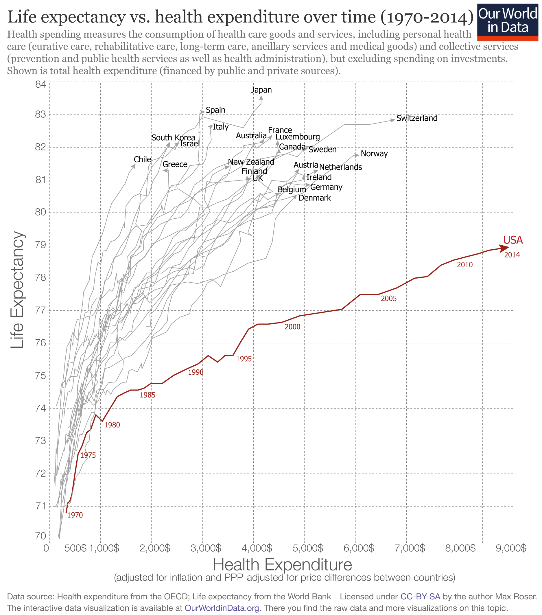
The US stands out as an outlier: the US spends far more on health than any other country, yet the life expectancy of the American population is not longer but actually shorter than in other countries that spend far less.
This graph and much more can be found in the Our World In Data-entry on how healthcare is financed.
The graph shows the relationship between what a country spends on health per person and life expectancy in that country between 1970 and 2014 for a number of rich countries.
If we look at the time trend for each country we first notice that all countries have followed an upward trajectory – the population lives increasingly longer as health expenditure increased. But again the US stands out as the the country is following a much flatter trajectory; gains in life expectancy from additional health spending in the U.S. were much smaller than in the other high-income countries, particularly since the mid-1980s.
This development led to a large inequality between the US and other rich countries: In the US health spending per capita is often more than three-times higher than in other rich countries, yet the populations of countries with much lower health spending than the US enjoy considerably longer lives. In the most extreme case we see that Americans spend 5-times more than Chileans, but the population of Chile actually lives longer than Americans. The table at the end of this post shows the latest data for all countries so that you can study the data directly.
Life expectancy vs. health expenditure over time, 1970-2014 1
Why is this?
There are several aspects that contribute to the US being such an extreme outlier: Studies find that administrative costs in the health sector are higher in the US than in other countries; The price comparisons between countries rely on adjustment which are not ideally suited for comparisons of health costs and this might make comparisons more difficult. Sometimes it is also pointed out in these comparisons that violence rates in the US are higher than in other rich countries (and this is true). But while this could explain the difference in levels, it is not a likely explanation for the difference in trends. Over the period shown in the chart above violence and homicides have fallen in the US more than in other rich countries and this should have led to a narrowing of the difference to other countries and not to the increase that we see.
One of the reasons for the underachievement of the US is the large inequality in health spending. The chart above showed that average per capita spending on health is exceptionally high, but the average does not tell you about how much each individual in the US receives. The US healthcare system is characterized by little access to care for some and very high expenditure on health by others.
The following graph shows this inequality. The top 5% of spenders accounts for almost half of all health care spending in the US.
This chart is produced by the National Institute for Health Care Management (NIHCM) and it shows the cumulative distribution of healthcare spending per person in the U.S., using data on personal expenditures during the year 2009. The source of the data is the Medical Expenditure Panel Survey – a nationally representative longitudinal survey that collects information on healthcare utilization and expenditure, health insurance, and health status, as well sociodemographic and economic characteristics for civilian non-institutionalized population. According to the source, the data refers to ‘non-institutionalized civilian population’, in the sense that it excludes care provided to residents of institutions, such as long-term care facilities and penitentiaries, as well as care for military and other non-civilian members of the population. The data corresponds to ‘personal healthcare services’, in the sense that they exclude administrative costs, research, capital investments and many other public and private programs such as school health and worksite wellness.
This graph should be read similarly to a Lorenz curve: the fact that the cumulative distribution of spending bends sharply away from the 45% degree line is a measure of high inequality (this is the intuition of the Gini coefficient that we discuss in our income inequality data entry). As it can be seen, the top 5% of spenders account for almost half of spending, and the top 1% account for more than 20%. Some concentration in expenditure is certainly to be expected when looking at the distribution across the entire population – because it is in the nature of healthcare that some individuals, particularly those older and with complicated health conditions, will require large expenditure –, these figures seem remarkably large and suggest important inequality in access. Indeed, the publisher of the graph notes that a report from the Medicare Payment Assessment Commission shows that personal spending for individuals covered by Medicaid is less concentrated than for the population as a whole.
Cumulative distribution of personal healthcare spending in the U.S., 2009 – NIHCM (2012) 2

Appendix
Latest available data on life expectancy and spending on health per capita in OECD countries.
| Country | Life exectancy | Health Spending per capita |
|---|---|---|
| United States | 78.94 | 9,024.21 $ |
| Switzerland | 82.85 | 6,786.57 $ |
| Norway | 81.75 | 6,081.00 $ |
| Netherlands | 81.30 | 5,276.60 $ |
| Germany | 80.84 | 5,119.21 $ |
| Sweden | 81.96 | 5,065.16 $ |
| Ireland | 81.15 | 5,001.32 $ |
| Austria | 81.34 | 4,896.00 $ |
| Denmark | 80.55 | 4,857.03 $ |
| Belgium | 80.59 | 4,522.04 $ |
| Canada | 81.96 | 4,495.69 $ |
| Luxembourg | 82.21 | 4,478.97 $ |
| France | 82.37 | 4,366.99 $ |
| Australia | 82.25 | 4,206.85 $ |
| Japan | 83.59 | 4,152.37 $ |
| United Kingdom | 81.06 | 3,971.39 $ |
| Iceland | 82.06 | 3,896.93 $ |
| Finland | 81.13 | 3,871.39 $ |
| New Zealand | 81.40 | 3,537.26 $ |
| Italy | 82.69 | 3,206.83 $ |
| Spain | 83.08 | 3,053.07 $ |
| Slovenia | 80.52 | 2,598.91 $ |
| Portugal | 80.72 | 2,583.84 $ |
| Israel | 82.15 | 2,547.40 $ |
| Czech Republic | 78.28 | 2,386.34 $ |
| South Korea | 82.16 | 2,361.44 $ |
| Greece | 81.29 | 2,220.11 $ |
| Slovakia | 76.71 | 1,970.52 $ |
| Hungary | 75.87 | 1,796.60 $ |
| Estonia | 77.24 | 1,724.51 $ |
| Lithuania | 73.97 | 1,720.84 $ |
| Chile | 81.50 | 1,688.52 $ |
| Poland | 77.25 | 1,624.87 $ |
| Costa Rica | 79.40 | 1,393.95 $ |
| Russia | 70.37 | 1,368.75 $ |
| Latvia | 74.19 | 1,295.01 $ |
| South Africa | 57.18 | 1,146.47 $ |
| Mexico | 76.72 | 1,052.66 $ |
| Turkey | 75.16 | 990.19 $ |
| Colombia | 73.99 | 964.50 $ |
| China | 75.78 | 730.52 $ |
| Indonesia | 68.89 | 302.12 $ |
| India | 68.01 | 267.41 $ |
Footnotes
- Graph produced by Max Roser on 25 July 2016 using OECD data on health spending and World Bank data on life expectancy at birth.The definition of health spending given by the OECD is the following: “Health spending measures the final consumption of health care goods and services (i.e. current health expenditure) including personal health care (curative care, rehabilitative care, long-term care, ancillary services and medical goods) and collective services (prevention and public health services as well as health administration), but excluding spending on investments. Health care is financed through a mix of financing arrangements including government spending and compulsory health insurance (“public”) as well as voluntary health insurance and private funds such as households’ out-of-pocket payments, NGOs and private corporations (“private”). This indicator is presented as a total and by type of financing (“public”, “private”, “out-of-pocket”) and is measured as a share of GDP, as a share of total health spending and in USD per capita (using economy-wide PPPs).”
- Figure published in Schoenman, Julie A. “The concentration of health care spending.” NIHCM Foundation Data Brief, National Institute of Health Care Management, Washington, DC (2012). Original source data comes from the Medical Expenditure Panel Survey – a nationally representative longitudinal survey that collects information on healthcare utilization and expenditure, health insurance, and health status, as well sociodemographic and economic characteristics for civilian non-institutionalized population. According to the source, the data refers to ‘non-institutionalized civilian population’, in the sense that it excludes care provided to residents of institutions, such as long-term care facilities and penitentiaries, as well as care for military and other non-civilian members of the population. The data corresponds to ‘personal healthcare services’, in the sense that they exclude administrative costs, research, capital investments and many other public and private programs such as school health and worksite wellness.