Inequality isn’t driven by taxes—it’s driven by the power of capital in relation to workers
Over the past four decades, American household incomes have become strikingly more unequal, along an unsustainable path. But as of late 2017, prospects for attacking inequality are bleak, whether or not the Republican-controlled U.S. Congress manages to pass a tax cut favoring businesses and high-income households. Fundamental changes in income and wealth distribution will require equally fundamental changes in the way the economy generates and distributes pre-tax incomes.
What is required are policies that go beyond the tax code to shift the very balance of power between workers and employers. Doing so would allow real wages to catch up to productivity and capital gains to be more equitably shared among the population. It would shrink inequality for years to come.
This paper looks at several key topics that relate to our country’s growing inequality and the ways in which it can be remedied.
First, it’s worth examining the likely macroeconomic effects of the tax package. They will be visible but small. Republican efforts will push up the federal deficit as a means to transfer funds to business and rich households. Growth dynamics sketched below suggest that the deficit and incomes of the rich cannot rise indefinitely. This analysis also shows how, over time, rising income inequality creates greater concentration of wealth, which is almost certainly on the cards.1 For rich households, wealth accumulation is driven by high saving rates from high incomes, capital gains on existing assets, and receipts from initial public offerings which are highly visible but quantitatively not so important. Over the past few decades, capital gains have been a main driver for wealth concentration.
Crucially, this analysis looks to answer why inequality has grown so steadily since around 1980. The principal cause is that wealthy “capitalist” households have benefitted from rising business profits while wage-earning “worker” households have fallen behind. Are higher profits the consequence of greater power of firms to raise prices against wages, or else their ability to hold down wages against prices? Analysis of producing sectors suggests the latter based upon the creation and extension of a vast low wage labor market.
Growth of Income Inequality
The Cambridge University economist José Gabriel Palma has proposed a helpful measure of inequality – the ratio of the average household income for a wealthy group (for example, the wealthiest one percent) over that of a poorer group (or groups). Based on data from the well-known 2016 Congressional Budget Office study of inequality, rescaled to fit the national accounts, Figure 1 shows Palma ratios for the top one percent vs. households between the 61st and 99th percentiles of the size distribution (the “middle class”) and the sixty percent at the bottom.
Figure 1: Palma Ratios for Top 1% vs 61st-99th Percentile (“Middle class”) and Lower 60% Households
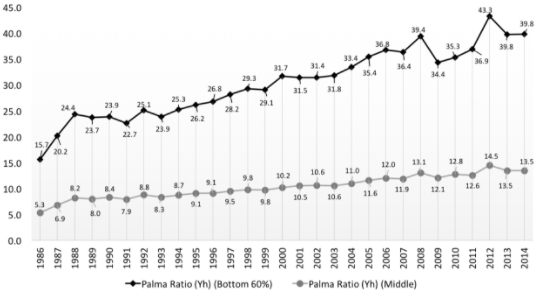
Based on total income per household (Yh) Based on calculations from the Congressional Budget Office and National Income and Product Accounts
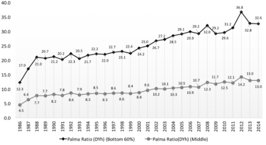
Based on disposable income per household (DYh) Based on calculations from the Congressional Budget Office and National Income and Product Accounts
The upper diagram presents ratios for total (or pre-tax) income; the lower focuses on disposable income. Either way, rising inequality stands out, although taxes and transfers cut back on the extreme ratios shown in the diagram at the top. Even for disposable income, the ratio of the rich against the middle class grew at 3.85% per year. Against the bottom group, the growth rate was 3.54%. Such rising inequality is unprecedented. These rates are a full percentage point higher than output growth, and are not sustainable in the long run. The reason is that the share of any variable (say the income of the top one percent) in the total cannot increase indefinitely. Herbert Stein’s Law “that if something cannot grow forever, it will stop” always applies in macroeconomics.2
Minimal Macro Impacts
As of this writing, precise estimates of the effects of the Republican tax cuts on household incomes are not available. Ballpark numbers show an increase of more than five percent of mean disposable income for the top one percent (more for the top 0.1 percent) with blips of less than one percent for most of the rest, all front-loaded toward early years of a ten-year program. The 2014 Palma ratio of 13 for the middle class might rise above 14, an insulting jump atop an inglorious trend.
In round numbers, the annual disposable income of all rich households is $2 trillion. Their consumption is $1 trillion in an economy with overall demand of $20 trillion. Their extra consumption from the tax windfall might be less than $40 billion, about 0.2% of total demand. Through this channel at least, the macroeconomic boost from upper income tax reduction would be barely visible.3
Business tax reductions have been sold as a means to stimulate economic growth. One way to assess possibilities is to look at how much firms are willing to spend on new capital goods (“net investment” in economists’ jargon). The US output/capital ratio is stable in the medium run so that the level of the capital stock regulates the size of the macro system. In other words, output increases track capital. Its growth also stimulates increasing labor productivity, with effects on employment and the real wage.
Will the Republicans’ ballyhooed corporate tax cuts boost net investment? Business net acquisition of new assets (capital, cash, reduction in debt, etc.) runs in the range of a few percent of the existing capital stock. Figure 2 shows data on profits and changes in assets beginning in 1998 (the first year for which capital estimates consistent with the national accounts are readily available).
Figure 2: Gross Profits, Net Profits, Net Profits - Corporate Taxes, and Business Net Asset Accumulation / Business Capital (Kb)
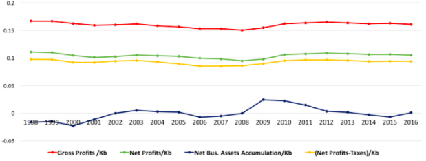
Based on calculations from the National Income and Product Accounts and supporting tables
In the national accounts, “profits”’ (or “operating surplus” or “earnings’) are the difference between corporate revenue and costs of intermediate inputs, direct taxes, and labor pay4. They are an income flow originating from production, as opposed to returns to holding financial claims such as stocks and bonds as discussed below. The relevant rates of return do not move together, contrary to much mainstream economic doctrine5.
Overall business profits relative to capital run between 15% and 20% (plotted in red). The green schedule shows profits net of depreciation (also called a capital consumption allowance or CCA). The yellow illustrates a further subtraction from operating surplus due to corporate taxes. Compared to depreciation, the tax bite is minimal, one or two percent of capital or four percent of value-added. Finally, payments of interest and dividends, over 40% of which flow to rich households, limit net asset accumulation (blue) to one or two percent of capital, especially in wake of the financial crisis.
Will reducing the corporate tax bite strongly boost the ratio of net business investment to capital and so feed into higher output? No doubt a substantial proportion of higher available profits would be distributed as interest, dividends, and share buybacks. In Figure 2, the band between the green and yellow schedules represents the corporate tax burden. The yellow might shift upward by 0.01 from proposed tax cuts, shrinking the band. If in response net investment relative to capital increases by 0.005 (very much on the high side), then medium-term output expansion could go up by a similar amount – well less than the growth rate increases touted by tax cutters.
Finally, a word on deficits and debt. Again in round numbers, Federal debt is $20 trillion and the deficit is $500 billion. The ratio implies a debt growth rate of 2.5%, similar to output growth. If the tax package initially reduces receipts by $150 billion per year but (optimistically) draws in $50 billion in extra revenue due to higher output, then the growth rate of debt would rise by 0.3%. If the output growth rate does not rise as much (as is likely) and/or interest rates go up, Stein’s Law for the debt/GDP ratio could kick in. An unsustainable debt burden would match unsustainably rising inequality.
Root causes of Inequality
In sum, in the short to medium run, regressive Republican tax reductions would have barely visible macroeconomic effects while providing an income fillip at the top. In the longer run, the weight of the debt burden could rise.
As discussed later, the other side of the coin is that progressive tax/transfer policies would not strongly affect the macro situation but could ameliorate income inequality slightly. They would stimulate consumer demand because lower income households have low or negative saving rates. The trends illustrated in Figure 1 will not easily be reversed.
To explore the possibilities, we need background on sources of pre-tax income. The upper diagram in Figure 1 shows that rich households, with a mean income exceeding $2 million per year, have 40 times the income of the bottom 60% and 13.5 times payments going to the middle class. Figure 3 shows where the one percent’s money has been coming from.
Figure 3: Sources of Income for the Top One Percent
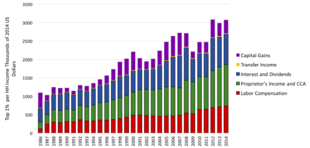
Based on calculations from the Congressional Budget Office and National Income and Product Accounts
Starting from the bottom of the bars, labor compensation has increased dramatically. It is not the main source for the top one percent, although earnings exceeding $500,000 per year in Figure 3 are not be sneezed at. To a degree they represent income from capital because they include bonuses and stock options. In the macroeconomic scheme of things, the top one percent’s labor income is not of central importance because it amounts to “only” nine percent of the total. For the top 1% it is also less than income of business proprietors, rents, CCA, etc. (second from the bottom).
The third major component of incomes in Figure 3 is made up of financial transfers including interest and dividends deriving from holdings of financial claims. They are nourished by business profits but as noted above the linkage is not necessarily close. Labor pay, profits, and proprietors’ income etc. all enter into the national accounts. Capital gains also put money into households’ pockets but because they are not a cost of production they do not enter the national accounts. Figure 3 shows that they have added substantially to income since the 1990s (see further discussion below).6
The middle class and households with lower incomes are in different economic boats. Over 70% of middle class mean income of $180,000 comes from wages and salaries. Labor earnings and transfers each provide around 45% of the lower group’s $65,000 per year. To use traditional terms, the top one percent are close to being “capitalists;” the rest of us are “workers” subsidized by fiscal transfers.
After the 1970s profits moved upward, as shown in Figure 4 which is based on total capital stock (periods of recession are shaded). As noted above, the output/capital ratio is fairly stable over business cycles. Both the profit share and profit rate have trended steadily up since the Reagan recession of the early 1980s. Given that the bulk of income of the top one percent comes from profits through one channel or another, the obvious inference is that the rising Palma ratios in Figure 1 were fueled by an ongoing shift away from wages in the “functional” income distribution between labor and capital.
Figure 4: US Output/Capital Ratio, Profit Share, and Profit Rate
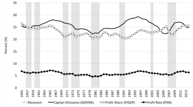
Based on Total Capital Stock (KK) Based on calculations from the National Income and Product Accounts and supporting tables
Lagging Real Wages
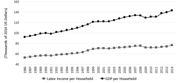
One common explanation for the distributional shift is that real wages have not grown as fast as labor productivity. Figure 5 is an illustration. Clearly, growth of output per household has outpaced labor income. The increases in payments to labor that did occur flowed predominantly to high income households.
Figure 5: Real GDP and Real Labor Compensation per Household Over Time
Based on calculations from the National Income and Product Accounts
The question is why wages of ordinary households lagged. Changes in institutional norms (laws, unionization and other of the game) surely played a role. Robert Solow (2015) from MIT, the doyen of mainstream macroeconomics, observes that labor suffered for reasons including “the decay of unions and collective bargaining, the explicit hardening of business attitudes, the popularity of right-to-work laws, and the fact that the wage lag seems to have begun at about the same time as the Reagan presidency [see Figure 4!] all point in the same direction: the share of wages in national value added may have fallen because the social bargaining power of labor has diminished.”
Divide-and-rule in a “fissuring” labor market, as described by David Weil (2014) is one aspect of this process. Globalization, which came to the forefront in the 2016 Presidential election, also played a role. Perhaps one-quarter of job losses in US manufacturing (the sector most open to international trade) can be explained by import competition. It bears note, however, that manufacturing provides less than ten percent of total employment.
Goods and Services Markets vs. Labor Markets
In macroeconomics, the crucial big market involves labor and capital. On the“sell-side,” business firms may have power to push up prices of goods and services against wages as the main source of demand. On the “buy-side,” they can hold down wages against prices. Solow, Weil, and other commentators adopt a buy-side interpretation. Many mainstream economists, however, concentrate on firms’ “monopoly power” to set prices. Looking at behavior of profits and rents in detail provides a means to assess their position
Presumably, monopoly would show up in different profit performances across broad sectors of the economy – they would have different levels of power. The buy-side interpretation suggests that profits across sectors would trend up together. Eschewing econometrics for present purposes, we can look at the evidence graphically.
Figure 6 shows ratios of total and sectoral business profits to total capital and value-added.7 The main sources of profits are manufacturing and services, trailed by trade and transport. The widely discussed information and finance and insurance sectors are lesser contributors to total profits.8
Figure 6: Total and Sectoral Business Profits vs. Total Business Capital and Value-Added (Real Estate Rental and Leasing Excluded)
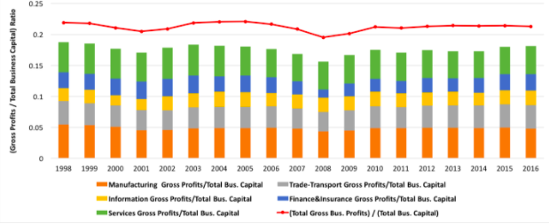
Based on business capital Based on calculations from the National Income and Product Accounts and supporting tables
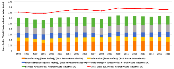
Based on total value-added Based on calculations from the National Income and Product Accounts and supporting tables
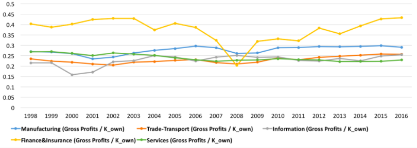
Figure 7 shows ratios of the total and sectors to their own levels of capital and value-added. Ratios to capital for manufacturing and trade and transport cluster in the same range. They have an upward trend, consistent with the wage-lag interpretation of rising inequality. Finance and insurance was obviously affected strongly by the Great Recession but its ratio at the end of the period was higher than at the start. The information sector includes an anachronistic mix of publishing, movies, internet portals, and data processing. Its steady increase in profits after the dotcom crash probably does incorporate an element of monopoly power.
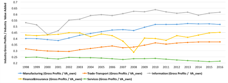
Figure 7: Sectoral Gross Profits vs. Own Capital Stock and Value-Added
Based on capital stock Based on calculations from the National Income and Product Accounts and supporting tables
Based on value-added Based on calculations from the National Income and Product Accounts and supporting tables
Compared to value-added, manufacturing, trade and transport, and (recession aside) finance and insurance show consistent upward trends. Information has enjoyed hearty profits growth. Services lag, possibly reflecting a lack of monopoly power. Taken together, at the broad sectoral level the diagrams do not provide strong support for the monopoly hypothesis.
Real Estate and Rents
A second strand of mainstream discussion attributes inequality to higher rents. If you want to confront that idea with macroeconomic data, you have to look at real estate.
Somewhat confusingly, the national accounts include separate treatments of commercial real estate on one hand and consumers’ “housing services” on the other. The former shows up in the accounts for production and the latter is included in personal consumption expenditure. As noted in footnote 6, profits in real estate are estimated as a residual. They amount to about 95% of the sector’s value-added. An upward trend is consistent with wage repression. The ratio of profits to capital fell with the recession, but then recovered to a bit less than 10%.
“Consumption of housing services” is fairly stable at a GDP share of a bit more than ten percent, trending slowly upward. Its level is inferred from visible real estate data. Three-quarters of the total is made up of “imputed” costs of owner-occupied housing. Subtracting costs gives an estimate of rents. Because it is estimated as a residual the rental share of GDP went up by around two percentage points in wake of the financial crisis due to the sharp reduction in interest payments that the Fed engineered.
For more two centuries, economists have recognized that rents (as well as housing services) respond to demand derived from other income flows. American income has become highly concentrated but the bulk still goes to the lower classes, explaining why ratios of real estate profits and housing consumption to capital and GDP are stable (billionaires’ towers along Manhattan’s 58th street notwithstanding). But we are talking about big numbers here, on the order of 10% of GDP, far larger than any proposed tax cuts. Over time their accumulation contributes to more concentration of wealth.
Rising Wealth
Wealth or net worth is the difference between the values of an economic actor’s assets and liabilities. It rises in response to positive saving and increases in prices of assets or decreases in prices of liabilities (“capital gains,” in a phrase). The accounting underlying GDP and financial tabulations sets private sector net worth equal to the sum of the value of capital, government debt, and a country’s net foreign assets. Private sector wealth can be further split between households and corporate business. Claims (stocks and bonds) issued by business are its “liabilities” and households’ or the rest of the world’s assets.9
The share of wealth held by affluent households is the topic at hand. Putting together time series on the distribution of wealth is not easy. The share of the top one percent of households as estimated from expenditure survey or income tax data was around 50% just prior to the Great Depression, fell to 25% in the 1960s, and is now in the vicinity of 40%.
As shown in Figure 3, in the recent period, a main source of growth for household income has been capital gains. They feed into rising wealth. The impact can be seen from a couple of angles. One is the time path of the ratio of a share price index to business capital, emphasized by the late Yale economist James Tobin and conventionally called q. Figure 8 shows how q has varied over time. Its increase beginning in the early 1990s contributed to the large capital gains of the top one percent of households shown in Figure 3. One reason why Stein’s Law may apply to household wealth is that q will “revert to mean” or a value close to one.
Figure 8: Determination of Business Sector Valuation Ratio q
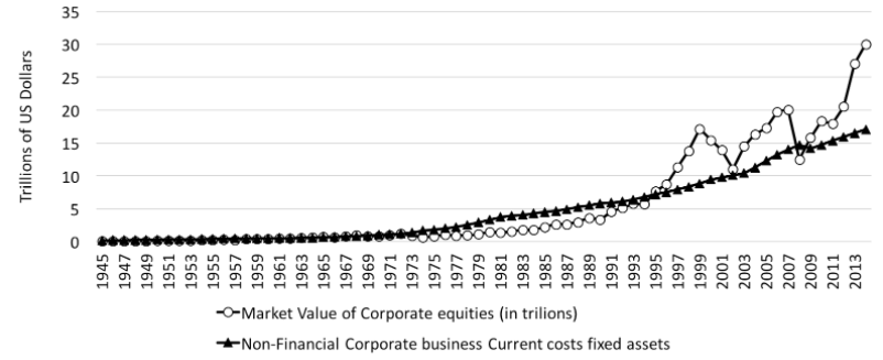
Based on calculations from Federal Reserve financial accounts
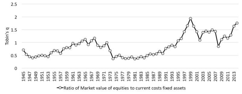
Based on calculations from Federal Reserve financial accounts
The other viewpoint is from the side of business. Because of the accounting conventions described above, households’ capital gains are corporations’ capital losses. Recall that after-tax business profits break down into financial transfers to households, CCA, and net saving (there is also a “discrepancy” due to minor transfers). Figure 9 illustrates this decomposition over time. The discrepancy is small, and takes both signs. As we have seen net business saving is also “small” – well less than a trillion dollars per year.
Figure 9: Business Saving and Holding Losses
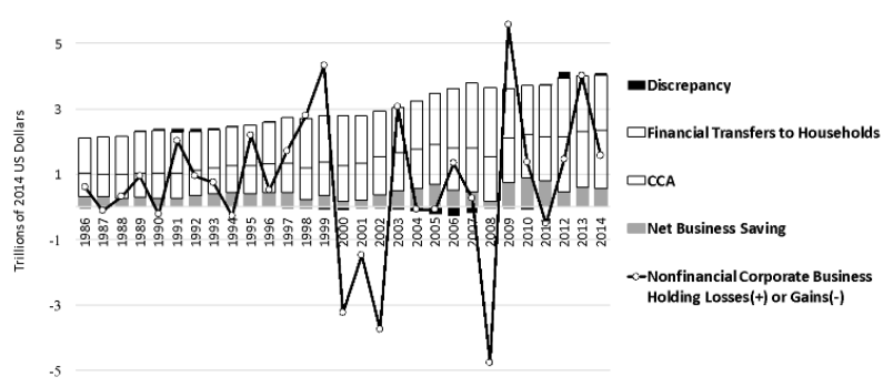
Based on calculations from Federal Reserve financial accounts and the National Income and Product Accounts
The Federal Reserve publishes estimates of business “holding losses” on outstanding liabilities, basically equity. The solid line shows their levels over almost 30 years. Pretty clearly, business holding losses have exceeded net saving so there has been a substantial transfer of corporate wealth to households. That is, households got more money to save while corporations suffered paper losses.
What Is To Be Done?
Figure 1 shows clearly it took 30 or 40 years for the present distributional mess to emerge. It may well take a similar span of time to clean it up. Progressive tax changes of $100 billion here or $50 billion there are not going to impact overall inequality. The same is true of once-off interventions such as raising the minimum wage by a few dollars per hour.
Long-term improvement requires changes to the present situation that can cumulate over time. Following a simulation model described in an earlier paper,10 it is clear that the growth rate of the real wage will have to exceed productivity growth (pegged at 1.4% per year) if Palma ratios are to be forced downward. In a baseline simulation, setting wage and productivity growth rates equal holds Palmas constant. The baseline also assumes that capital gains are equal to business net asset accumulation, holding q constant in Figure 8.
To do better, we can assume that real wage growth is 1.75% per year for the bottom two household groups with zero growth for the top one percent. Shifting economic power from business toward labor would be essential to make these changes happen.
An additional assumption is that there is a one percent annual decrease in the coefficient tying rich proprietors’ incomes to output. Tax reform would be needed to assure this result.
Similarly, there is a one percent annual decrease in the coefficient relating financial transfers to the upper one percent to profits, i.e. firms invest more and distribute less.
These numbers are arbitrary, but illustrative. Over 40 years, such changes would reduce disposable income Palmas by about 50%, more or less reversing the trends in Figure 1. Their effect on wealth, however, would be minimal.
As we have seen, owners of wealth maintain their positions because their large stocks of assets generate big capital gains along with interest and dividend payments from which their saving rate is high. A public wealth fund could become an alternative vehicle for accumulation. Perhaps the best-known proposal is still the one put forward 65 years ago by the Swedish trade union economists Gösta Rehn and Rudolf Meidner, who wanted to extract money from firms to support workers’ pensions. An American version might be financed by a 50% tax on capital gains. It could transfer two percent of its assets each year to households with low incomes. The transfer would mimic a guaranteed minimum income, subject over time to asset price fluctuations.
Figure 10 shows how the institutional changes mentioned above combined with a wealth fund would affect the economy over time. Palma ratios would steadily shift downward. With its high saving rate, an aggressive public fund could make a real dent in the concentration of wealth.
Figure 10: Baseline vs Combined Redistribution Policies and Wealth fund
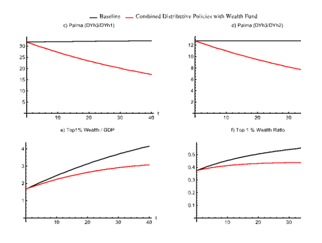
Model simulations based on constructed data set.
It is by no means obvious that all these progressive changes could come into place. If not, and if Republican tax plans for the rich materialize, the distributional mess will only get worse.
Final Word
Congress’s budget and legislative proposals could only work for President Donald Trump’s “struggling families” and “forgotten people” if they would generate strong trickle-down growth. Structural constraints on income distribution and wealth dynamics won’t let trickle-down happen. Trump’s slogan about making America great again is for the top one percent of the income distribution – effectively a “capitalist” class – not for “workers” in the middle of the distribution or the struggling, forgotten households further down.
I have outlined a feasible progressive alternative, which would generate broad-based progress. Progressive changes may not take hold. If not, and if Trump-style interventions materialize, the distributional mess and his “American carnage” will only get worse until Stein’s Law enters into force.
References
Congressional Budget Office (2016) “The Distribution of Household Income and Federal Taxes, 2013,” https://www.cbo.gov/publicatio…
Solow, Robert M. (2015) “The Future of Work: Why Wages Aren’t Keeping Up,” https://psmag.com/economics/the-future-of-work-why-wages-arent-keeping-up
Taylor, Lance (2017) “Trump-Style Policies Will Deepen the ‘American Carnage’“, https://www.ineteconomics.org/…
Weil, David (2014) The Fissured Workplace, Cambridge MA: Harvard University Press
- 1. To be worsened, one might add, if Republicans succeed in reducing or eliminating estate taxes.
- 2. Stein, a well-known conservative economist, was chair of the Council of Economic Advisors under Presidents Nixon and Ford.
- 3. The Bush tax cuts of the early 1990s were mostly directed toward households.They had a minimal impact on GDP and extra tax revenue.
- 4. There are technical differences between profits as reported in the national accounts and other sources such as S&P earnings per share, but they track closely together.
- 5. The long run returns to holding shares (dividends plus capital gains) and housing (rents plus capital gains) are around seven percent. Bonds fetch two or three percent, depending on maturity. Real bond interest rates are negatively correlated with profit rates across business cycles.
- 6. Share buybacks, another financial transfer, now approach a trillion dollars per year. They are basically a portfolio shift. Firms move profits and/or higher debt into cash and use it to retire outstanding equity. Dividends, capital gains, and buybacks all favor share owners. Interest does the same for bondholders.
- 7. The “real estate rental and leasing” sector is included in Figure 2 because it pays taxes and depreciates capital. Its profits are basically rents minus the sum of intermediate inputs, indirect taxes, and wages, and exceed the sum of profits in manufacturing and services. The sector is omitted from Figures 6 and 7 on grounds of incomparability. See further discussion below.
- 8. For the record, finance and insurance are often combined with real estate into a FIRE sector, which accounts for a big chunk of total profits. Figure 7 shows why a relatively small “FI” tail does not have much impact on a big “RE” dog.
- 9. Classifying the value of shares as a business liability contravenes standard accounting practice but is built solidly into all systems of national accounts.
- 10. See Taylor (2017), based on modeling supported by INET.