Back in early 2009, commentators starting seeing “green shoots” of economic recovery. More than five years later they may finally be growing into GDP and employment.
Writing recently in the New York Times David Leonhardt saw green shoots of falling income inequality based on work by Stephen J. Rose of George Washington University. Rose in turn draws on the Berkeley economist Emmanuel Saez and the Congressional Budget Office. A closer look suggests that Leonhardt’s shoots will not sprout into sustained shared income growth very soon.
The CBO study is of particular interest because it presents estimates of income from different sources for groups of households all across the distribution, from 1986 through 2011. One can see how distributive slices have changed. In a project sponsored by the Institute for New Economic Thinking at the New School for Social Research we have rescaled the CBO numbers to be consistent with the national income and product accounts, to give insight into their macroeconomic significance.
Let’s look first at households in the top one percent of the income size distribution. These people generate most household saving and hold substantial wealth, including equity which produces capital gains. Figure 1 shows their mean income levels per household over time – late in the decade it was more than $2 million per year. The green segments toward the bottom of the bars show that the well-off do receive pre-tax income from labor compensation. But bigger chunks come from interest and dividends along with proprietors’ incomes, like lawyers’ fees and big farmers’ subsidies and sales.
Figure 1. Real per household incomes top 1%
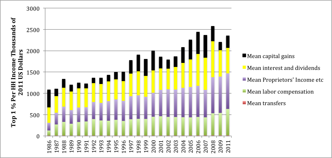
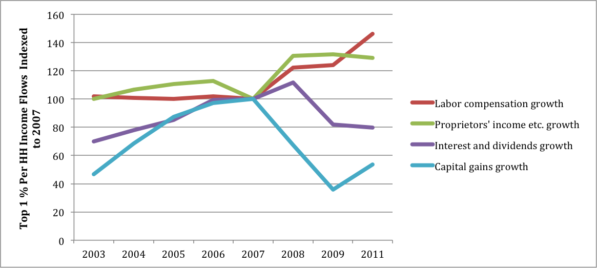
The chart indicates that rich households steadily gained income until 2010. Over two decades their share of the household total rose by around 10% – a very large change for such an indicator. Thereafter their income growth dropped off for a couple years due to low interest rates and reduced capital gains. Figure 2, presenting indexes of incoming income flows per household, centered on levels of 100 in 2007, shows what happened. Financial returns declined, but at the same time labor compensation including wages and benefits from employers as well as proprietors’ incomes kept climbing.
Figure 2. Growth plots top 1% omitting transfers
What about the period following 2011? Interest rates have remained low, but sooner or later they will rise. The S&P 500 stock market index, meanwhile, has gone up by 65% since early 2012, presumably generating substantial realized capital gains.
After Federal taxes, income disparities remain large. The top one percent pay somewhat higher overall rates (23% of pre-tax income as opposed to 18% for all households). Their direct taxes are more progressive (rates of 24% and 10.5% respectively) but they are scarcely touched by regressive FICA employment taxes.
In 2011 there were 1.1 million households in the top one percent with a mean pre-tax income of $2.073 million, not including capital gains, for a total of $2.28 trillion. GDP (which does not include capital gains) was $15.52 trillion so the top group absorbed 14.7% of total output. Including capital gains, in 2014 they probably got close to three trillion. Fifteen percent of GDP represents enormous economic power.
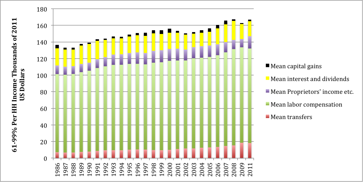
The “middle class” broadly comprises households between the 60 th and 99th percentiles of the size distribution. Figure 3 shows their income sources. Note the difference in the scales between Figures 1 and 3. The top one percent’s income is a factor of ten higher than the middle class’s. It simply does not fit with flows to the other 99% of households.
Middle class mean income is around $160,000, concentrated in the group’s top decile. These households have positive saving rates and visible net worth, largely concentrated in housing. Figure 3 shows that labor compensation makes up almost 70% of their total income. The pre-tax level increased from around $95,000 per household in 1986 to $110,000 in 2011 – a modest growth rate of half a percent per year. In the USA, of course, around seven percent of compensation is absorbed by FICA, explaining the 21% tax rate that these households pay (their direct tax rate is 11%).
Other significant income sources are interest and dividends, proprietors’ incomes and government transfers such as Social Security, Medicare, unemployment insurance, and (at lower income levels) food stamps and Medicaid.
Figure 3. Real per household incomes 61-99%
After 2007, Figure 4 shows that middle class labor income continued to stagnate. Financial incomes went down and transfers went up, as is to be expected in a recession. Both will probably revert toward pre-recession levels, leaving overall income for these households dominated by trends in real wages.
Figure 4. Growth plots 61-99%, omitting capital gains and proprietors’ income
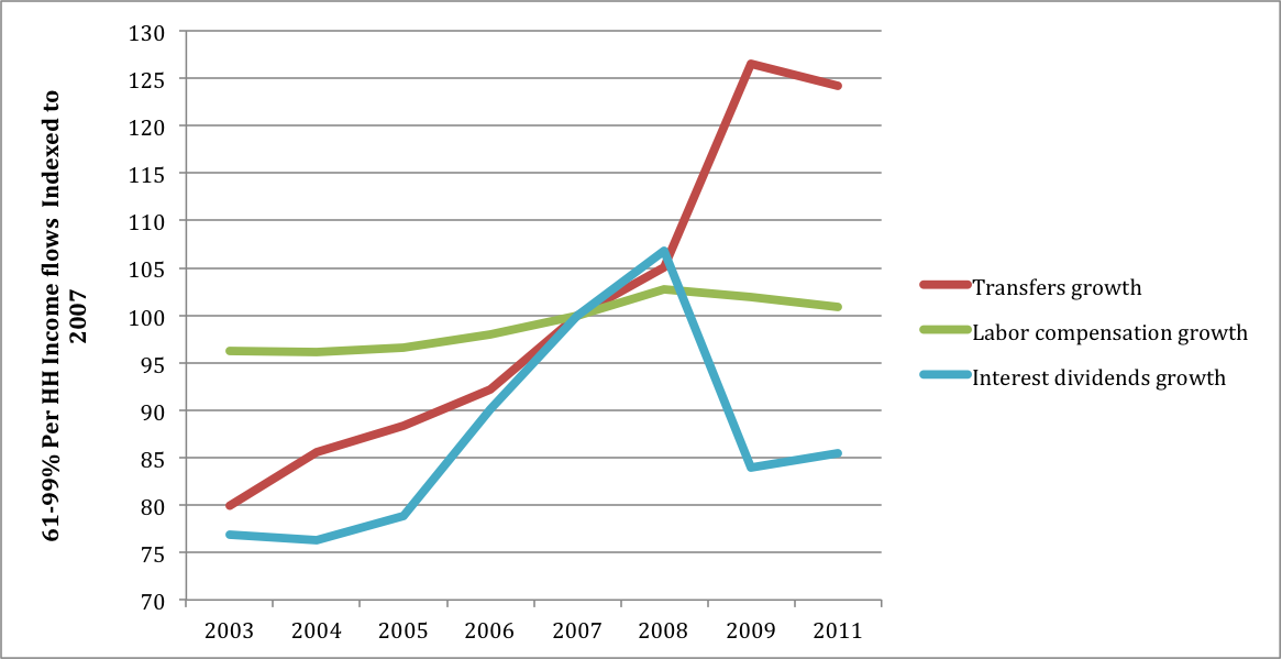
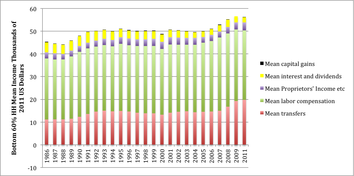
Figure 5 shows that households in the bottom 60% are highly dependent on labor income for their mean level of $55,000. In 2011, transfers were around two-thirds of wages. In reported consumer expenditure data, this group has a negative savings rate, meaning that people spend more than they receive. Their average wealth is close to zero, so that financial incomes are very small.
Figure 5. Real per household incomes bottom 60%
In Figure 6 one can see falling wages and rising transfers after the recession got underway. The latter will decline with recovery. Rising minimum wages in ranges currently being discussed could marginally benefit low income recipients but how widespread they will be remains to be seen.
Figure 6. Growth plots bottom 60%, omitting capital gains, interest and dividends and proprietors’ income

Figures 7 and 8 draw a similar picture for the bottom twenty percent. Their household income in the $30,000 range is dominated by labor compensation and transfers. With recession, wages dropped off but transfers rose sharply. Thanks to credits they have negative direct taxes but are still hammered by FICA.
Figure 7. Real per household incomes bottom 20%

Figure 8. Growth plots bottom 20%, omitting capital gains, interest and dividends, and proprietors’ income

These comparisons can be summarized in a ratio named for Gabriel Palma of the University of Cambridge, the “Palma ratio” which draws a contrast between the rich and poor. Figures 9 and 10 present ratios of per household income of the top one percent to the other groups, with and without capital gains respectively.
Figure 9. Palma ratios for the top 1% vs the other groups (with capital gains)

Figure 10. Palma ratios for the top 1% vs the other groups (without capital gains)

With capital gains included the ratios were strikingly high before 2007, but then dropped off rapidly. The decrease in Figure 10 is less sharp, reflecting the instability of asset prices. For the reasons discussed above, the Palma ratios almost certainly increased after 2011.
This latest green shoots theory of income redistribution looks rather doubtful.