Atlas Grotesk
Atlas Grotesk serves primary headings as well as smaller utility text and metadata. Released in 2012 by Commercial Type, it is a clean but authoritative sans serif comfortable for extended reading. Stylistically, its blend of European grotesques from the 1950s and American gothics projects attitude worth owning.
- Styles used: Black, Regular
- Hosting: Self-hosted files for both styles were purchased from Commercial Type and have been incorporated directly into the site’s CSS (Cascading Style Sheets).
- License: You are allowed to use these styles on 1 domain with up to 500,000 unique visitors/month. The Institute is responsible for upgrading this license if usage exceeds the number of domains or unique visitors/month.
Freight Text Pro
Freight Text Pro serves main body copy as well as secondary headings. Released by the Darden Studio, Freight is approachable and genuine, less classic while still being easy to read and scholarly. Modern italics and oldstyle numbers introduce rhythm and calligraphic texture.
- Styles used: Book (400), Book Italic (400), Bold (700), Bold Italic (700)
- Hosting: Freight’s fonts are hosted through Typekit’s Portfolio Plan tied to the user [email protected]. Using JavaScript, the site pulls in the right font styles from Typekit’s servers.
- License: The Typekit Portfolio Plan allows you to choose from 4200+ webfonts, and use an unlimited number of webfonts on an unlimited number of websites for $49.99/year (recurring billing). A kit with the 4 Freight styles has been created in the Institute’s account specifically for ineteconomics.org. This same kit can be extended to subdomains at that same URL.
- Altering this kit can negatively affect appearance and performance on the live site, but you are more than welcome to create new kits for new websites with other typographic needs—such as a one-of-a-kind promotional site.
- Your main restriction is that across all sites using your Typekit account, you’ll be limited to 500,000 pageviews/month. While Typekit will not automatically cut off your fonts if you exceed the limit, if you are consistently above, they will contact you to recommend an upgrade plan.
- The Institute is responsible for upgrading to the Performance Plan (1 million pageviews/month for $99.99/year) if usage exceeds the Portfolio Plan.
Fallback fonts
Even though support for both self-hosting fonts and Typekit’s service is well-established among modern browsers, we declare a string of fonts for the browser to use in the case that a browser does not support either option, or that a user disables webfonts.
- Atlas Grotesk’s fallback string:
"ITC Franklin Gothic Std", "Franklin ITC Pro", Helvetica, Arial, sans-serif; - Freight Text’s fallback string:
"Times New Roman", Times, serif;
Global scale
To maintain a singular typographic voice, rhythm, and ensure information hierarchy remains easy for users to understand, the site design utilizes a single type scale across all pages. Because this is a responsive site and we adjust typography to fit best across screen sizes, there are two versions of this scale—one for large screens and another for smaller screens.
While many times these styles correlate directly to semantic heading structure (
<h1>,<h2>, etc.), layouts/modules with specific hierarchy needs may apply these styles independent of heading tag in the source order. Additionally, in the codebase, we establish type styles as a relative unit based off of their pixel value, so that users may be able to scale the type up or down in their browser with the hierarchy remaining intact.
Type sizes in pixels and line-heights (in parentheses) are listed below. To view small-screen sizing, please shrink your browser width or view this style guide on a small-screened device.
Header 1
Header 2
Header 3
Header 4
Header 5
Header 6
Using headings in Craft
When entering longer bodies of text in Craft (e.g. a “Body” field for a blog article or “Full Text” field for a paper), you’ll be able to introduce headings from the formatting dropdown. In the dropdown, these headings are typeset in Arial and just show relative sizing, but each heading number corresponds to the headings in our global scale.
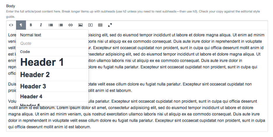
Maintaining a semantic heading structure is important for sighted users to digest content quickly, for screen readers and assisted users to navigate (e.g. allowing them to jump from one heading to the next), and search engines’ understanding of a page’s structure. When introducing headings to your text…
- Avoid using Heading 1. This will be reserved for the title of your page.
- Use second-level headings (Heading 2) for major sections, then if you need more structure, nest lower-level headings within those sections. Don’t skip heading levels when nesting.
- Do not use text formatting, such as bolding text, to simulate a heading level.
Blockquotes
Blockquotes can be added to either the Body (Enhanced) or Description (Enhanced) field. When adding a blockquote, you can select for your text to take a pullquote or blockquote style.
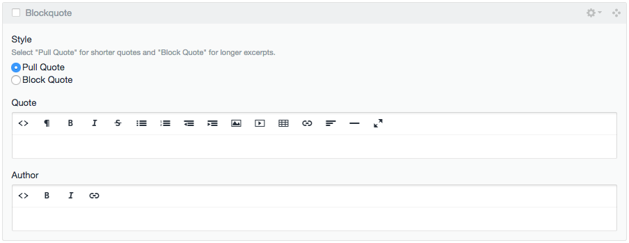
- A blockquote is for a block quotation: longer text that is set off from the main text, often because it is from an external citation. Reserve blockquotes for text that is longer than four (4) lines, or multiple paragraphs. A blockquote should fall in the reading flow of the content.
- A pullquote is styled in larger, more expressive text; it should be used to draw attention to short excerpts from the text and visually break up the page flow. If the pullquote is a quote rather than just an excerpt, attribution should be included.
This is an example of when you would use a blockquote style, because it is a lengthy quote that you’d like to surface purposefully in a particular order on the page:
The virtually unrestricted dynamics of the Walrasian general equilibrium system challenge a common interpretation of the Second Fundamental Theorem, namely, that redistribution followed by market exchange can implement any Pareto optimum. But without an account of how out-of-equilibrium behaviors of the market participants move the system to a competitive equilibrium, the Walrasian model does not show this. All that Arrow and Hahn claim for it is that “in a certain sense any desired efficient allocation can be achieved by redistribution of initial assets followed by the achievement of an equilibrium.
This is an example of when you would use a pullquote style, because it is a short excerpt highlighting a key point from an article.
One year ago, Ukraine did not have an elected president, nor a representative and functioning parliament which could elect a legitimate government.