Primary
The Institute’s primary navigation comprises (in order of appearance) About, Ideas & Papers, Grants & Research Programs, Community, and Education. These links are set, and listed in order of appearance, in “Primary Navigation” under the Globals tab in Craft. Each link has a title and URL. While it is technically possible to change these links and add others to the primary navigation, it is not recommended. The established information architecture was arrived at through careful consideration, and adding additional links may disturb how the navigation fits across screen sizes.
Each primary navigation page, along with the Homepage, has been established as a Single in Craft, because each only appears once on the site. The fields for each primary navigation page match that page’s design and content needs.

On large screens, the primary navigation links are listed next to each other and site search.
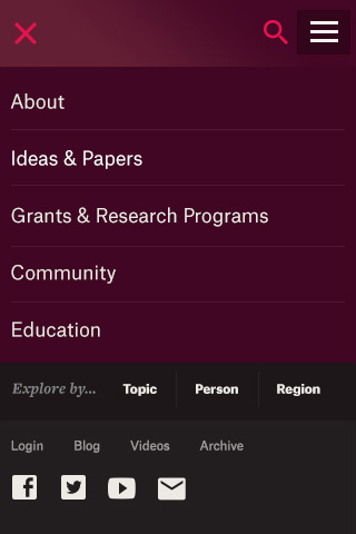
On smaller screens, this navigation collapses and stacks in an off-canvas menu.
Utility
Utility navigation houses tasks like login and search, along with a high-level link to the Institute’s content archive and crosslink to the Blog. The Blog is a frequently updated area of the site but not high enough level in the information architecture to merit a main navigation item. With ever-present links, this navigation provide users quick and broader ways to approach content— especially content they access frequently.
The Institute’s utility navigation comprises (in order of appearance) Login, Blog, Videos, and Archive. These links are set, and listed in order of appearance, in “Utility Navigation” under the Globals tab in Craft. Each link has a title and URL. The URL can link to an entry or an offsite link; linking to an entry maintains the integrity of the link if the content is relocated on the site.
While it is technically possible to change these links and add others to the utility navigation, it is not recommended. The established information architecture was arrived at through careful consideration, and adding additional links may disturb how the navigation fits across screen sizes.
On large screens, the utility navigation links are listed next to the Social and Explore navigation, and are locked to the top right corner of the browser.
On smaller screens, this navigation collapses into an off-canvas menu with primary navigation.
Social
Social navigation links to the Institute’s Facebook, Twitter, and YouTube accounts, as well as the Get Updates page. These links are set, and listed in order of appearance, in “Social Navigation” under the Globals tab in Craft. Each label corresponds to a particular icon and URL.
While it is technically possible to change these links and add others to the Social navigation, it is not recommended. The established information architecture was arrived at through careful consideration, and adding additional links may disturb how the navigation fits across screen sizes.
On large screens, the social navigation links are listed between the Utility and Explore navigation, and are locked to the top right corner of the browser.
On smaller screens, this navigation collapses into an off-canvas menu with primary navigation.
Explore
The Explore navigation elevates the key areas on which the Institute produces content. It lets users look at the forest before a tree, and is geared toward more topical exploration (less for the user who came to the site looking for something specific). More specifically, this navigation allows users to explore the site by topic, person, or region.
- By topic: 1 manually selected topic with sample content, and a full list of topics with their parents.
- By person: 1 featured notable profile with sample content, and links to 4 other individuals notable profiles. All selected manually.
- By region: 1 manually selected country with sample content, and a full list of regions and countries.
Each of these manually selected features can be chosen under Globals > Explore Navigation in Craft.
On large screens, the Explore navigation links are listed in a horizontal bar that’s locked to the top right corner of the browser. Clicking a link opens the off-canvas panel.
On smaller screens, this navigation collapses into an off-canvas menu with primary navigation. Instead of revealing sample content, the “Topic,” “Person,” and “Region,” links send users to landing pages with their respective lists.
Breadcrumb
The breadcrumb is an indicator of a page’s location within the site hierarchy, not the user’s path to that page.
On large screens, there are visual hints for users that—with a breadcrumb—can help them locate themselves on the site. For example, it’s a common behavior that clicking the logo returns users to the homepage. Users can also see the selected state of primary navigation. So, breadcrumbs only appear on fourth-level pages and below, with links to parents that are third-level and deeper.
On smaller screens, when much of the navigation is collapsed into an off-canvas menu, breadcrumbs appear on all third-level pages and below, with links to parents that are first-level and deeper.
Footer
The footer provides a constant way to contact the Institute (one of the places many users often look for this information), and also a home for the link to the newsletter signup.
The Institute’s footer navigation comprises (in order of appearance) Contact Us, Media Inquiries, Get Updates, Privacy Policy, and Terms of Use. These links are set, and listed in order of appearance, in “Footer Navigation” under the Globals tab in Craft. Each link has a title and URL. The URL can link to an entry or an offsite link; linking to an entry maintains the integrity of the link if the content is relocated on the site.
While it is technically possible to change these links and add others to the footer navigation, it is not recommended. The established information architecture was arrived at through careful consideration, and adding additional links may disturb how the navigation fits across screen sizes.
On large screens, the footer navigation links are listed at the bottom of the page with the site’s copyright.
On smaller screens, this navigation collapses into an off-canvas menu with primary navigation.
Deeper levels of navigation
All primary-navigation pages in Craft have been established as Structures, which means that pages can be added beneath them. The site accommodates navigation to pages that are up to four levels deep in the site.
Secondary navigation sits in a dark cream bar that extends beneath the primary navigation. This bar can accommodate any number of second-level links.

As more links are added to secondary navigation (and the screen size shrinks), they will wrap to a second line and extend the height of the dark cream bar.
On smaller screens, secondary navigation is accessible in the breadcrumb.
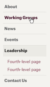
Tertiary navigation sits stacked, occupying the left two columns of the page area beneath primary and secondary navigation. Quaternary navigation is positioned tiered with the tertiary navigation. A few other rules for how these deeper levels of navigation work:
- Third- and fourth-level navigation is only visible on secondary navigation pages and deeper—unless that deeper page is a detail or profile page (anything listed in Craft as a Channel entry, e.g. Blog Article, Paper, or a User).
- With the site’s launch, third- and fourth-level navigation only appears in the Events and Young Scholars sections of the site.
- Detail and profile pages are not listed in navigation and do not typically have children (exception being Research Programs/YSI Working Groups).

On smaller screens, tertiary and quaternary navigation are accessible in the breadcrumb and an in-page dropdown.