Links can be applied to text in both shorter and longer rich text fields. To ensure accessibility, link styling is applied on the front-end depending on where the link is destined to appear. So, in longer rich text fields (“Body” or “Full Text”), there is no need to style links beyond their default styling in the WYSIWYG.
Call-to-action fields in Craft create a solid button with a chevron pointing to the right. These buttons are intended for short, clear, action-focused phrases—such as “Learn more” or “Register now.” In most cases, these buttons occupy a specific place in a page design, so if you click “add a row” to insert multiple buttons, only the first text/URL listed will display on the front-end.
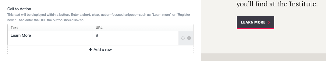
Live preview: creating a call-to-action button on the About page.
But, when creating a new generic page or listing page in a structure (e.g. creating a new generic page under About), you’ll be able to incorporate multiple call-to-action buttons, both next to each other and throughout your page—in either the main column or right rail.
Typically, you should reserve this button for the most important action you’d like users to take in a particular section of the page. If the link is to a URL outside the Institute’s website, the chevron will be replaced with a separate icon to indicate to users that the page is offsite.
To add a button in a rich text field on a generic page, you’ll need to follow these few steps:
- Type the text you’d like to serve as the button label.
- Highlight the text and create a link (either to an entry, asset, or offsite).
- Click the HTML icon in the toolbar for the field.
- Before the “>” that precedes your label, type in class=”button”, as shown below.
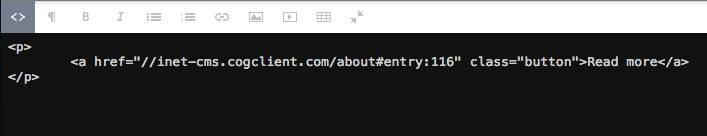
- Deselect the HTML icon.